---
category: general
scraped_at: '2025-11-12T14:07:04.031078'
title: Card step and Carousel step
url: /docs/cards-carousels
---
# Card step and Carousel step
The **Card step** allows you to provide some on-screen information in-line with the conversational experience & interface, either on a screen-based device or on mobile, and can contain an image, title, description, and buttons. The **Carousel step** creates a carousel (like a gallery) of multiple cards, so works similarly.
*Note: Both the Card and Carousel steps are only available on chat assistants.*
# Card step
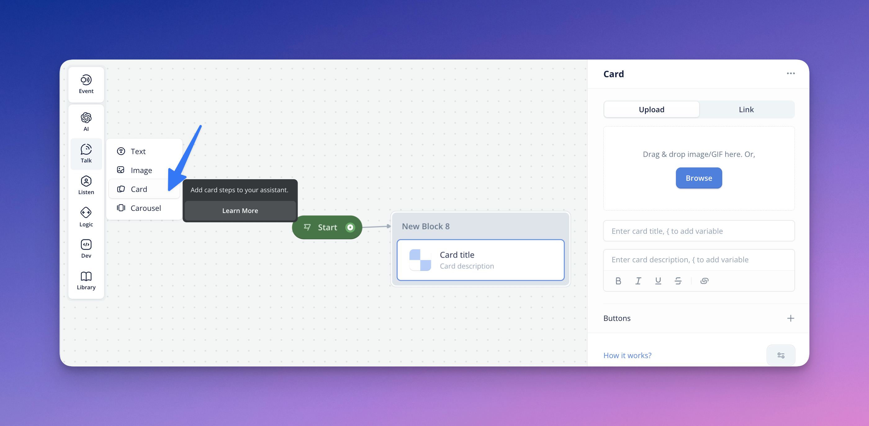
## Card image
To get started with the Card step for chat assistants, ensure you navigate inside a Card step and have an intended image or GIF to upload into your design. The image upload is exactly the same for the [image](https://developer.voiceflow.com/v2.0/docs/images) step.
Once your Card image is uploaded, you will notice that the icon on the Card step canvas-view will update to your Card image preview.
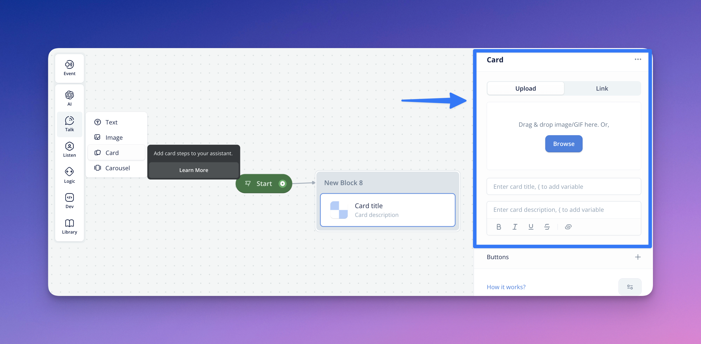
## Card title and card description
You can also give your Card a *Title* and an associated *Description*. In each of these fields, you can also use variable(s) (using'**{**' ) to make your card text fields more dynamic and personalized. And similar to Text steps, descriptions support markup styling.
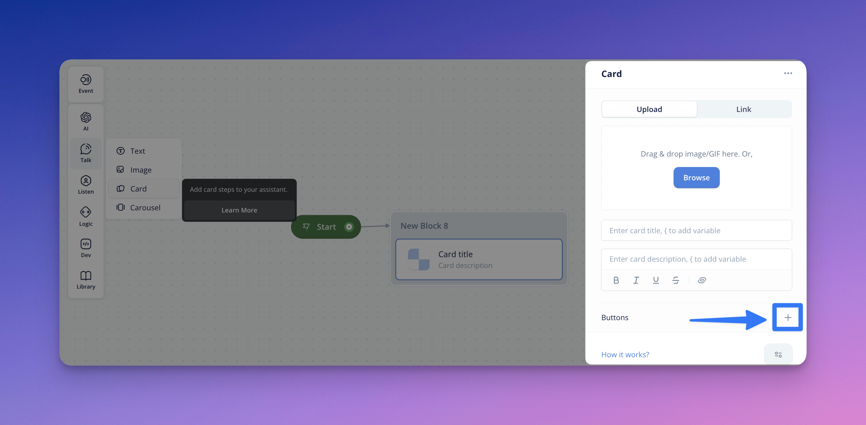
## Adding Buttons to Cards
You can configure & add paths to your Cards and present the end-user with Buttons. You can click the (+) by the Buttons section to add Buttons and configure the Button label (with text or variables).
Cards support an unlimited number of buttons (though we recommend max 3-5).
Unlike the Button step, **Card buttons persist after the user’s initial interaction**. This means they will remain active, and the user may return to the Card during their session and make another selection. Otherwise, they should work identically to the standalone [Button step](https://developer.voiceflow.com/v2.0/docs/buttons).
# Carousel step
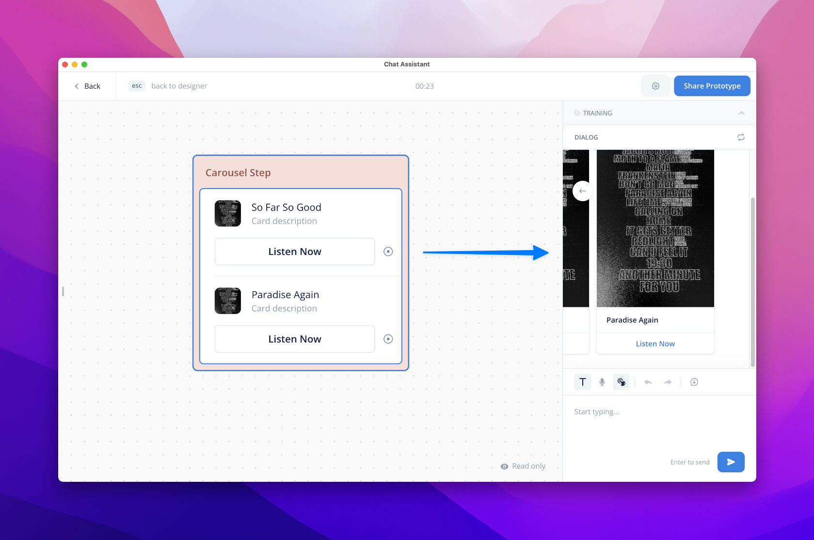
The Carousel Step lets you display a selection or gallery of cards to your end users via a carousel or list.
Cards support multiple modalities and can be configured with any combination of image, title, description, and buttons. You can access the Carousel Step under the ‘Talk’ bucket in all custom Chat assistants.
## Configuring a Card
Once you’ve added a Carousel Step, add the elements you want displayed in your card. This process is similar to the Card step.
For Visuals, you can upload or link an image or GIF. Upon upload, a preview of your file will show in the editor and canvas. Variables can be added to the Title and Description for personalization. And similar to Text steps, descriptions support markup styling.
## Adding Buttons
You can configure & add paths/call-to-actions to your Cards and present the end-user with Buttons. You can click the (+) by the Buttons section to add Buttons and configure the Button label (with text or variables).
Cards support an unlimited number of buttons (though we recommend max 3-5). For now, card buttons can only be connected to conversation paths.
Unlike the Button Step, Carousel buttons persist after the user’s initial interaction. This means they will remain active, and the user may return to the Carousel during their session and make another selection.
You can use persistent Carousel buttons to ensure important information like disclaimers or privacy policies is always accessible to your users.
## Adding Multiple Cards
To add more cards and to provide a gallery/carousel view to your end users, hit ‘Add Card’. You’ll see a new template under your current card.
## Display Options
Cards can be displayed as horizontal carousels (default) or vertical lists. To change the orientation, open the step’s settings menu. Under ‘Buttons layout’, choose your desired option: Carousel or List.
## No Match/No Reply
You can also configure No Match or No Reply to handle scenarios where your user does not behave with your carousel as expected. To do so, open the step’s settings menu and select your desired No Match and/or No Reply. Learn more about [No Match](https://developer.voiceflow.com/v2.0/docs/no-match) and [No Reply](https://developer.voiceflow.com/v2.0/docs/no-reply-response).
Updated about 1 month ago
---
[Image step](/docs/images)[Button step](/docs/buttons-v2)
Ask AI
* [Table of Contents](#)
* + [Card step](#card-step)
+ - [Card image](#card-image)
- [Card title and card description](#card-title-and-card-description)
- [Adding Buttons to Cards](#adding-buttons-to-cards)
+ [Carousel step](#carousel-step)
+ - [Configuring a Card](#configuring-a-card)
- [Adding Buttons](#adding-buttons)
- [Adding Multiple Cards](#adding-multiple-cards)
- [Display Options](#display-options)
- [No Match/No Reply](#no-matchno-reply)
