
MCP Design System Extractor
The MCP Design System Extractor server connects to a Storybook instance to extract and analyze design system components and metadata. You can:
List Components: Browse all UI components with categories, names, and stories, with pagination support
Extract HTML: Retrieve rendered HTML of specific component variants, with optional CSS styles
Search Components: Find components by name, title, or category with flexible queries
Analyze Variants: Get all variants/states of a specific component with their IDs and parameters
Extract Props: Fetch component props/API documentation including types and defaults
Detect Dependencies: Analyze which other components a given component internally uses
Access Theme Information: Extract design system theme details (colors, spacing, typography, breakpoints)
Search by Purpose: Find components by their functional use case (forms, navigation, feedback, etc.)
Analyze CSS: Extract design tokens from CSS files without returning full content by default
Get Composition Examples: Retrieve examples of how components are combined in real-world UI patterns
Analyzes external CSS files to extract design tokens, variables, and style information from Storybook assets.
Detects React components when analyzing component dependencies and relationships within Storybook components.
Extracts component information from Storybook design systems, including HTML, styles, component metadata, props documentation, theme information, and relationships between components.
Click on "Install Server".
Wait a few minutes for the server to deploy. Once ready, it will show a "Started" state.
In the chat, type
@followed by the MCP server name and your instructions, e.g., "@MCP Design System Extractorshow me all the button variants in our design system"
That's it! The server will respond to your query, and you can continue using it as needed.
Here is a step-by-step guide with screenshots.
MCP Design System Extractor
A Model Context Protocol (MCP) server that extracts component information from Storybook design systems. Connects to Storybook instances and extracts HTML, styles, and component metadata.
Installation
Using Claude CLI (Recommended)
claude mcp add design-system npx mcp-design-system-extractor@latest \
  --env STORYBOOK_URL=http://localhost:6006
With self-signed certificate:
claude mcp add design-system npx mcp-design-system-extractor@latest \
  --env STORYBOOK_URL=https://my-storybook.example.com \
  --env NODE_TLS_REJECT_UNAUTHORIZED=0
Using npm
npm install -g mcp-design-system-extractorThen configure in your MCP client (see Environment Variables).
From Source
git clone https://github.com/freema/mcp-design-system-extractor.git
cd mcp-design-system-extractor
npm install && npm run build
npm run setup  # Interactive setup for Claude Desktop
Related MCP server: Figma Storybook Component Matching MCP Server
Key Dependencies
Puppeteer: Uses headless Chrome for dynamic JavaScript component rendering
Chrome/Chromium: Required for Puppeteer (automatically handled in Docker)
Works with built Storybook distributions
Features
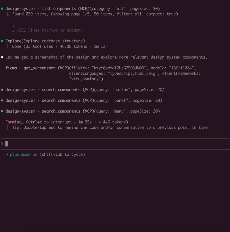
List Components: Get all available components from your Storybook with compact mode
Extract HTML: Get the rendered HTML of any component (async or sync mode)
Search Components: Find components by name, title, category, or purpose
Component Dependencies: Analyze which components are used within other components
Theme Information: Extract design system theme (colors, spacing, typography)
External CSS Analysis: Fetch and analyze CSS files to extract design tokens
Async Job Queue: Long-running operations run in background with job tracking
Environment Variables
Variable | Description | Default |
| URL of your Storybook instance |
|
| Set to |
|
Example with self-signed certificate:
{
  "mcpServers": {
    "design-system": {
      "command": "node",
      "args": ["/path/to/dist/index.js"],
      "env": {
        "STORYBOOK_URL": "https://my-storybook.example.com",
        "NODE_TLS_REJECT_UNAUTHORIZED": "0"
      }
    }
  }
}
Usage
See DEVELOPMENT.md for detailed setup instructions.
Available Tools (9 total)
Core Tools
list_components
Lists all available components from the Storybook instance
Use
compact: truefor minimal output (reduces response size)Filter by
categoryparameterSupports pagination with
pageandpageSize(default: 20)
get_component_html
Extracts HTML from a specific component story
Async by default: Returns
job_id, usejob_statusto poll for resultsSet
async: falsefor synchronous mode (usestimeoutparameter)Use
variantsOnly: trueto get list of available variants (sync, fast)Optional
includeStyles: truefor CSS extraction (Storybook CSS filtered out)Story ID format:
"component-name--story-name"or just"component-name"(auto-resolves to default variant)
search_components
Search components by name, title, category, or purpose
query: Search term (use"*"for all)purpose: Find by function ("form inputs", "navigation", "feedback", "buttons", etc.)searchIn: "name", "title", "category", or "all" (default)Supports pagination with
pageandpageSize
Component Analysis Tools
get_component_dependencies
Analyzes rendered HTML to find which other components are used internally
Detects React components, web components, and CSS class patterns
Requires story ID format:
"component-name--story-name"
Design System Tools
get_theme_info
Extracts design system theme (colors, spacing, typography, breakpoints)
Gets CSS custom properties/variables
Use
includeAll: truefor all CSS variables
get_external_css
DEFAULT: Returns only design tokens + file stats (avoids token limits)
Extracts & categorizes tokens: colors, spacing, typography, shadows
Use
includeFullCSS: trueonly when you need full CSS contentSecurity-protected: only accepts URLs from same domain as Storybook
Job Management Tools
job_status
Check status of an async job
Returns:
status,result(when completed),error(when failed)Poll this after calling
get_component_htmlin async mode
job_cancel
Cancel a queued or running job
Returns whether cancellation was successful
job_list
List all jobs with their status
Filter by
status: "all" (default), "active" (queued/running), "completed"Returns job list + queue statistics
Example Usage
// List all components (compact mode recommended)
await list_components({ compact: true });

// Search for components
await search_components({ query: "button", searchIn: "name" });

// Find components by purpose
await search_components({ purpose: "form inputs" });

// Get variants for a component
await get_component_html({
  componentId: "button",
  variantsOnly: true
});
// Returns: { variants: ["primary", "secondary", "disabled"] }

// Get HTML (async mode - default)
await get_component_html({ componentId: "button--primary" });
// Returns: { job_id: "job_xxx", status: "queued" }

// Poll for result
await job_status({ job_id: "job_xxx" });
// Returns: { status: "completed", result: { html: "...", classes: [...] } }

// Get HTML (sync mode)
await get_component_html({
  componentId: "button--primary",
  async: false,
  timeout: 30000
});
// Returns: { html: "...", classes: [...] }

// Get HTML with styles
await get_component_html({
  componentId: "button--primary",
  async: false,
  includeStyles: true
});

// Check all running jobs
await job_list({ status: "active" });

// Extract theme info
await get_theme_info({ includeAll: false });

// Get design tokens from CSS
await get_external_css({
  cssUrl: "https://my-storybook.com/assets/main.css"
});
AI Assistant Usage Tips
Start with discovery: Use
list_componentswithcompact: trueGet variants first: Use
get_component_htmlwithvariantsOnly: trueUse async for HTML: Default async mode prevents timeouts on large components
Poll job_status: Check job completion before reading results
Search by purpose: Use
search_componentswithpurposeparameter
Example Prompts
Once connected, you can use natural language prompts with Claude:

Component Discovery:
Show me all available button components in the design systemBuilding New Features:
I need to create a user profile card. Find relevant components
from the design system and show me their HTML structure.
Design System Analysis:
Extract the color palette and typography tokens from the design system.
I want to ensure my new component matches the existing styles.
Component Migration:
Get the HTML and styles for the "alert" component. I need to
recreate it in a different framework while keeping the same look.
Multi-Tool Workflow:
First list all form-related components, then get the HTML for
the input and select components. I'm building a registration form.
How It Works
Connects to Storybook via /index.json and /iframe.html endpoints. Uses Puppeteer with headless Chrome for dynamic JavaScript rendering. Long-running operations use an in-memory job queue with max 2 concurrent jobs and 1-hour TTL for completed jobs.
Troubleshooting
Ensure Storybook is running and
STORYBOOK_URLis correctUse
list_componentsfirst to see available componentsFor large components, use async mode (default) and poll
job_statusCheck
/index.jsonendpoint directly in browserSSL certificate errors: Set
NODE_TLS_REJECT_UNAUTHORIZED=0for self-signed certificatesSee DEVELOPMENT.md for detailed troubleshooting
Requirements
Node.js 18+
Chrome/Chromium (for Puppeteer)
Running Storybook instance
Development
See DEVELOPMENT.md for detailed development instructions.
Author
Created by Tomáš Grasl
License
MIT
Maintenance
Latest Blog Posts
- Your AI Chatbot Just Exposed Your CEO's Salary to an InternBy Om-Shree-0709 on .Agent IdentityMCP SecurityOAuth Delegation
- Why MCP Servers Need Execution Sandboxing (And Why Your Current Stack Isn't Enough)By Om-Shree-0709 on .Agentic AiPrompt InjectionWebAssembly
MCP directory API
We provide all the information about MCP servers via our MCP API.
curl -X GET 'https://glama.ai/api/mcp/v1/servers/freema/mcp-design-system-extractor'
If you have feedback or need assistance with the MCP directory API, please join our Discord server