artimuse_en.md•9.05 kB
# Content
# We Tested It for You: nano banana Is Impressive — An "Aesthetic Blind Test" with Dingo × ArtiMuse
Recently, everyone's been experimenting with nano banana's image generation capabilities, and we jumped on board too. But we didn't just look at "can it generate images?" — we cared more about "are these images actually good-looking, and why?"
So our team used it as a sample factory — first generating a batch of different style images with nano banana, then having ArtiMuse provide overall scores + 8-dimensional critiques, with Dingo orchestrating the entire evaluation pipeline, unified threshold judgment, and finally producing an easy-to-understand visual report.
## Why Dingo × ArtiMuse?
ArtiMuse is essentially an aesthetic engine that "can see images and reason about them" — it doesn't just give you an overall score and leave. Instead, it breaks down an image into eight perspectives for explanation: composition, visual elements, technical execution, originality, theme expression, emotional response, gestalt completion, and comprehensive assessment. After seeing the scores, users can follow these dimensions to take action: where to crop, where to reduce elements, where to refine details — everything becomes crystal clear. To make this "reasoning ability" reliable, we created ArtiMuse-10K at a scale of 10,000 images, covering photography, painting, design, and AIGC. Each image has expert annotations with overall scores and eight-dimensional ratings. The subjects and styles are diverse enough that the learned model is adaptable and generalizes more stably. For scoring, we didn't take the old "classification → mapping" approach, but treated scores as continuous values (which can be understood as a Token-as-Score approach). The benefits are stability, repeatability, and the ability to distinguish subtle but critical differences. In actual comparisons, ArtiMuse shows higher correlation on common aesthetic datasets, and most importantly, it doesn't just tell users the score, but can clearly explain the reasoning behind that score, making image selection, review, and quality control easy to advance.
[ArtiMuse QR Code (local)](../../../../../artimuse/ArtiMuse/assets/images/QRcode.jpg)
In engineering practice, Dingo transforms this "aesthetic understanding" capability into a smooth pipeline: images are fed in, and the built-in RuleImageArtimuse creates tasks via HTTP and polls status at intervals. When tasks complete, it retrieves the score_overall, uses local thresholds (default 6) for unified Good/Bad judgment, while writing the server's fine-grained data directly into reason for later report display and issue tracking with clear evidence. When more comprehensive evaluation is needed, Dingo can also run other rules in parallel, such as directly flagging invalid dimensions when aspect ratio is greater than 4 or less than 0.25, using NIMA for clarity (common threshold 5.5), PHash + CNN for duplicate detection, and CLIP for image-text relevance scoring (can also switch to sentence-level embedding for more stability). With this complete setup, you get not just a score, but a systematic evidence chain and actionable improvement directions — standards are aligned, processes are fixed, and collaboration involves less friction.
[Local file](../assets/dingo-logo.png)
Without further ado, let's look at the results of this pop quiz. The results are straightforward: 20 samples total, default threshold of 6 points; 15 passed (75%), 5 rejected; end-to-end completion in about 2 minutes 6 seconds, averaging ≈6.3 seconds/image (mainly due to conservative polling intervals). High-scoring samples generally share characteristics of "clear subjects, natural lighting, detailed fidelity, clear narrative"; those judged as low-scoring mostly suffer from stickers/logos taking up too much screen space, over-stylization leading to detail loss, or overly flat composition resulting in insufficient visual tension.
Let's examine how to measure the quality of each image through some "typical cases"!
First, what catches our eye is the city in neon lights:
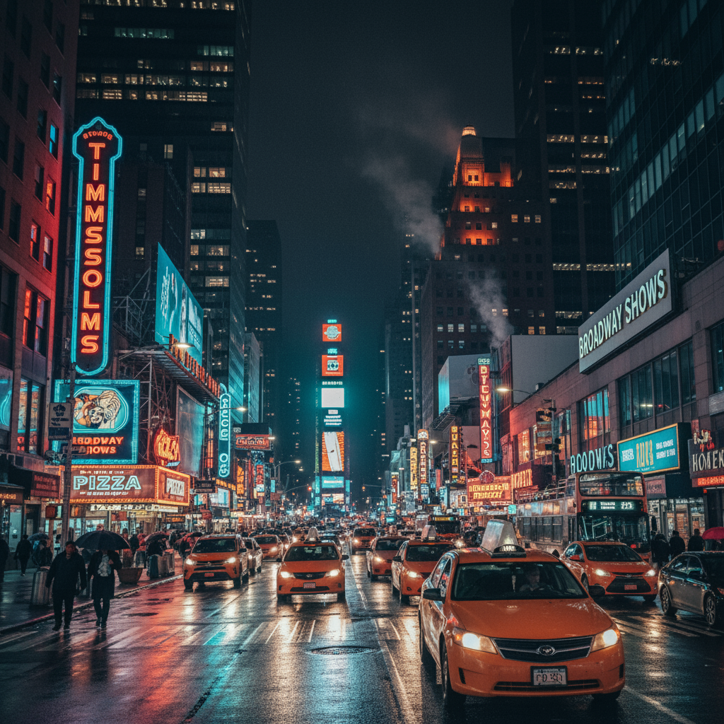
It scored 7.73 total. ArtiMuse's evaluation: The image layers and visual flow are very clear: streets and buildings steadily guide the viewer's gaze toward the image center, with neon signs and reflections creating atmospheric feel; technically, exposure and sharpness are on point, with neon and wet road reflection details maxed out. The minor flaw is slightly bright hotspots — if the highlights were compressed a bit more, the completeness would be even higher.
Then we see an elderly craftsman with his handicrafts:
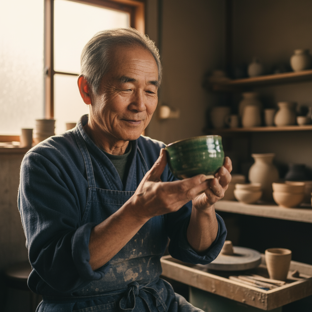
This image earned a high score of 7.42. Warm light falls on the craftsman and artifacts, with stable composition and established narrative. The background pottery is blurred but not chaotic, making it very pleasant to view. In ArtiMuse's assessment, this image not only performs well in theme expression but also excels in technical execution — precise focus, rich details, unified color tone; the only small regret is in "originality," where the subject matter is somewhat traditional with less surprise factor.
The third and fourth images are some underperforming examples:

Here's a super cute sticker bear for your desktop~ It scored 4.82 total. It's not poor image quality — on the contrary, the lines are clean and details are clear, but the problem lies in visual tension and gestalt: composition is too flat, layers are thin, decorative feel stronger than narrative, resulting in "looks cute, but lacks aesthetic depth." If it's for emoji stickers, it would be perfectly fine, but when placed in aesthetic scoring, unfortunately, it tends to suffer.
The final example is a pure logo with minimalist graphics:

It received a total score of 5.68. Very functional with good recognition, but naturally can't score high on "originality, emotional impact, and overall artistry" — this type of image is OK in "quality control/compliance" scenarios, but if considered as a "beautiful featured image," it has some disadvantages.
If you also want to upgrade from "intuitive image selection" to "standardized selection," the logic of this combination is actually simple: ArtiMuse first breaks down each image into 8 dimensions to provide reasoning and scores, then feeds the total score back to Dingo; Dingo uses a unified threshold for Good/Bad judgment (default 6, easily adjustable), and also supports running other rules in parallel such as dimension validity, clarity (NIMA), duplicate detection, and image-text relevance, producing a comprehensive "multi-dimensional health report" in one go. Our own experience: image selection efficiency and communication costs drop dramatically — especially when teams need unified aesthetic standards.
For specific parameters, here are some references: for external display and brand launches, it's recommended to set thresholds at 6.5–7, preferring quality over quantity; for content production/daily image selection, 5.8–6.2 offers a balance between efficiency and quality; for teaching or creative iteration, use 5.5–6 to retain more edge cases for "reverse practice." If you prioritize speed, you can also tighten polling intervals from 5 seconds to 2–3 seconds, with a 90-second upper limit, which will significantly compress total processing time.
Here's a small checklist for easy reference:
- **Want content publishing gates/brand quality control**: Enable ArtiMuse + clarity/dimension/duplicate/relevance quartet in Dingo, get reports on one page;
- **Want large-batch image selection**: Set threshold to 6 first, publish Good ones, keep Bad ones for manual review or improvement lists;
- **Want creative improvement/teaching feedback**: Pay more attention to ArtiMuse's dimensional critique excerpts, review following "composition/lighting/element reduction/narrative" four steps for rapid progress.
**Immediate reproduction (open source repositories)**: Dingo (GitHub) https://github.com/MigoXLab/dingo | ArtiMuse (GitHub) https://github.com/thunderbolt215/ArtiMuse
Note on sample sources: The examples above were generated/edited by nano banana, used solely for technical evaluation. Want to get our evaluation templates, rule configurations, and example scripts from this test? Comment or DM "Dingo Image Evaluation" and I'll send you the reproducible material package. We'll also continue updating comparison results for more styles (like "character consistency," "multi-image fusion," "product demonstrations"), making "beautiful" truly become a pipeline for your team.