---
title: "Iconography - Cloudscape Design System"
source: "https://cloudscape.design/foundation/visual-foundation/iconography/"
created: 2025-11-23
description: "Iconography is a visual language used to represent features, functionality, or content. Icons are intended to be simple visual elements that are recognized and understood immediately."
---
## Icon set
The basic icon set represents actions, status, and symbols. Icons are displayed in 4 sizes based on its usage — normal (16x16px), medium (20x20px), big (32x32px), large (48x48px). Icon variants may also be utilized to best support the icon's usage. Refer to [icon usage](https://cloudscape.design/components/icon/) for more guidelines regarding the 8 variants.
| Icon | Name | Type | Description |
| --- | --- | --- | --- |
| | add-plus | Action | Use to add an element in-line. |
| | anchor-link | Action | Use to represent linking to a specific content element. |
| | angle-down | Action | Use to collapse a tutorial card. |
| | angle-left-double | Action | Use to represent a direction of movement for objects or information from one state to another. |
| | angle-left | Action | Use to control pagination within a long data set. |
| | angle-right-double | Action | Use to represent a direction of movement for objects or information from one state to another. |
| | angle-right | Action | Use to control pagination within a long data set. |
| | angle-up | Action | Use to expand a tutorial card. |
| | arrow-left | Action | Use to navigate left. |
| | arrow-right | Action | Use to navigate right. |
| | arrow-up | Action | Use to navigate up. |
| | arrow-down | Action | Use to navigate down. |
| | at-symbol | Symbol | Use to insert references like files or usernames. |
| | audio-full | Action | Use to represent audio is at full volume. |
| | audio-half | Action | Use to represent audio is at approximately half volume. |
| | audio-off | Action | Use to represent audio is off. |
| | backward-10-seconds | Action | Use to jump backward 10 seconds. |
| | bug | Symbol | Use to represent issues (bugs). |
| | call | Symbol | Use to represent communication via phone call. |
| | calendar | Action | Use to invoke a date picker. |
| | caret-down-filled | Action | Use to indicate sort order within a table or to hide content from view within a collapsible element. Example: In sections, a card, or select dropdowns. |
| | caret-down | Action | Use to indicate an unsorted column within a table or a non-active state of the caret-down-filled icon. |
| | caret-left-filled | Action | An alternative to the caret-right-filled icon for interfaces structured from right-to-left. |
| | caret-right-filled | Action | Use to open hidden content into view within a collapsible element. Example: In sections or a card. |
| | caret-up-filled | Action | Use to indicate sort order of a column within a table. |
| | caret-up | Action | Use to indicate a non-active state of the caret-up-filled icon. |
| | check | Action and Symbol | Use to confirm a change or indicate the selection of an element. |
| | contact | Symbol | Use to represent the direct one-on-one communication. |
| | close | Action | Use to remove a page element away from view. Example: Modal or side panel. |
| | closed-caption | Action | Use to indicate closed captions. |
| | closed-caption-unavailable | Symbol | Use to indicate closed captions are unavailable. |
| | copy | Action | Use to copy a code snippet or a resource’s configurations. |
| | command-prompt | Action | Use to open command prompts. |
| | delete-marker | Action | Use to delete a marker or file. |
| | download | Action | Use to start downloading a file onto the user’s machine. |
| | drag-indicator | Action | Use to drag and drop an element. |
| | edit | Action | Use to invoke editing functionality. |
| | ellipsis | Action | Use to open the icon variant of the button dropdown. |
| | envelope | Symbol | Use to represent communication via email. |
| | exit-full-screen | Action | Use to exit full screen. |
| | expand | Action | Use to increase the size of the page element in view. |
| | external | Action | Use to label navigation which will direct users outside of the current service. |
| | face-happy | Action | Use to represent positive sentiment. |
| | face-happy-filled | Action | Use to represent user has selected positive sentiment. |
| | face-neutral | Action | Use to represent neutral sentiment. |
| | face-neutral-filled | Action | Use to represent user has selected neutral sentiment. |
| | face-sad | Action | Use to represent negative sentiment. |
| | face-sad-filled | Action | Use to represent user has selected negative sentiment. |
| | file-open | Symbol | Use to represent an opened file within a file management structure. |
| | file | Symbol | Use to represent a file within a file management structure. |
| | filter | Symbol | Use to represent the ability to filter an element. |
| | flag | Action | Use to flag a resource. |
| | folder-open | Symbol | Use to represent an opened folder within a file management structure. |
| | folder | Symbol | Use to represent a folder within a file management structure. |
| | forward-10-seconds | Action | Use to jump forward 10 seconds. |
| | full-screen | Action | Use to expand media to fill the entire screen. |
| | gen-ai | Symbol | Used to indicate that a process is powered by generative AI. |
| | globe | Symbol | Use to communicate global context. |
| | grid-view | Action | Use to change to a grid view. |
| | group-active | Action | Use to represent the active group. |
| | group | Action | Use to represent a group. |
| | heart | Action | Use to indicate that an element can be saved into a larger collection. |
| | heart-filled | Action | Use to indicate that an element has been saved into a larger collection. |
| | history | Symbol | Use to represent history or historical data. |
| | insert-row | Action | Use to indicate inserting a row into a table. |
| | key | Symbol | Use to represent a key within the context of security. |
| | keyboard | Action | Use to indicate keyboard input. |
| | list-view | Action | Use to change to a list view. |
| | location-pin | Symbol | Use to indicate a specific location within a map. |
| | lock-private | Symbol | Use to represent an artifact as private or secure. |
| | map | Action | Use to invoke a map view. |
| | menu | Action | Use to open the [side navigation](https://cloudscape.design/components/side-navigation/) panel. |
| | microphone | Action | Use to represent vocal communication method. Example: Voice recording. |
| | microphone-off | Action | Use to represent microphone is off. |
| | mini-player | Action | Use to invoke a mini-player video. |
| | multiscreen | Action | Use to represent multiscreen view. |
| | notification | Action | Use to open notifications into view. |
| | pause | Action | Use to pause media. |
| | play | Action | Use to play media. |
| | refresh | Action | Use to refresh the content within a page element. Example: Table or formfield. |
| | remove | Action | Use to indicate removal of an element. |
| | resize-area | Action | Use to resize an available area. |
| | script | Action | Use to indicate script view. |
| | redo | Action | Use to redo an action within the interface. |
| | security | Symbol | Use to represent security recommendations. |
| | search | Symbol | Use to represent the ability to search an element. |
| | send | Action | Use to enable users to send their text entry. |
| | settings | Action | Use to open the settings of an element. Example: A table. |
| | share | Symbol | Use to represent sharing. |
| | shrink | Action | Use to indicate shrinking a view or window. |
| | slash | Symbol | Use to insert modes or quick actions in prompt input. |
| | star-filled | Action | Use as part of a rating system to represent a positive rating value. |
| | star-half | Action | Use as part of a rating system to represent a portion of a rating value. |
| | star | Action | Use as part of a rating system to represent an empty rating value. |
| | status-info | Status | Indicate information, tips, or that a resource is running correctly but has recommendations for improvements. It is also used to open the [help panel](https://cloudscape.design/components/help-panel/). |
| | status-in-progress | Status | Indicate that a process is in progress and running without errors. |
| | status-negative | Status | Indicate that a resource or process has failed and cannot recover without user intervention. |
| | status-pending | Status | Indicate that a resource or process is no longer running and severity is not relevant. |
| | status-positive | Status | Indicate that a resource is running correctly or a process has finished without errors. |
| | status-stopped | Status | Indicate that a resource, service, or process is no longer running and severity is not relevant. |
| | status-warning | Status | Indicate that a resource or process is working but is either unreliable or trending towards a critical state. |
| | status-not-started | Status | Indicate that a resource or process is in its initial state and no execution has begun yet. |
| | stop-circle | Action | Use to stop a process. |
| | subtract-minus | Action | Use to subtract an element in-line. |
| | suggestions | Symbol | Use to represent suggestions. |
| | support | Action | Use to open the support menu. |
| | thumbs-down-filled | Action | Use to represent user has downvoted an item. |
| | thumbs-down | Action | Use to indicate downvoting an item. |
| | thumbs-up-filled | Action | Use to represent user has upvoted an item. |
| | thumbs-up | Action | Use to indicate upvoting an item. |
| | ticket | Symbol | Use to represent a ticket. |
| | transcript | Action | Use to view the transcript of a video or other media. |
| | treeview-collapse | Action | Use to collapse a branch from view within a tree view. |
| | treeview-expand | Action | Use to open a branch into view within a tree view. |
| | undo | Action | Use to undo an action within the interface. |
| | unlocked | Symbol | Use to represent an artifact that is public or unsecure. |
| | upload-download | Action | Use to indicate uploading and downloading. |
| | upload | Action | Use to invoke the ability for the user to upload a file. |
| | user-profile-active | Action | Use to represent the currently active user. |
| | user-profile | Action | Use to open the user profile options. |
| | video-off | Action | Use to represent webcam access/ permissions are off. |
| | video-on | Action | Use to represent webcam access/ permissions are on. |
| | video-unavailable | Action | Use to represent webcam access/ permissions are not accepted. |
| | video-camera-off | Action | Use to represent video is off. |
| | video-camera-on | Action | Use to represent video is on. |
| | video-camera-unavailable | Action | Use to represent video is unavailable. |
| | view-full | Action | Use to alter the view of a page element to expand full-screen to the page. |
| | view-horizontal | Action | Use to alter the view of a page element horizontally on the page. |
| | view-vertical | Action | Use to alter the view of a page element vertically on the page. |
| | zoom-in | Action | Use to enlarge the view of an area. |
| | zoom-out | Action | Use to reduce the view of an area. |
| | zoom-to-fit | Action | Use to resize to the container. |
## General guidelines
- Use labels with status and symbol icons.
- Don't use icons with page, section, or sub section headlines.
- Don't combine multiple icons into one object or action.
## Custom icons
### Design
When designing a custom icon consider the following:
- Icons must be 16x16px. Some Cloudscape components will resize icons depending on the context.
- Icons should primarily be designed using 2px strokes to maintain a consistent style. However, filled elements are allowed in the following cases:
- To highlight key parts of an icon for emphasis or to draw attention, such as the `view-horizontal` icon.
- For elements equal to or smaller than 2x2px, where strokes may not be visually effective. In such cases, using fills without strokes ensures clarity and precision, such as the `keyboard` icon.
- When icons require different states, such as a default and selected state. For example, a `heart` icon can use a stroke for its default state and a filled style for its selected state `heart-filled`.
- Ensure that each line is accurately aligned to the pixel grid in the icon template. Cloudscape components will adjust the stroke width based on the size of the icon.
- Simplify the layer structure without grouping or masking layers.
- Cloudscape components will adjust the color based on the icon’s concrete usage and context.
- Save or export your icon as an SVG. When doing so, don’t convert the line stroke to outline.
### Implementation
SVG files exported from design tools like Figma or Illustrator often include unnecessary attributes that are incompatible with the [icon](https://cloudscape.design/components/icon/) component. The icon component automatically applies styles such as colors and stroke width based on the parent components, their states (for example, [Button component with an icon](https://cloudscape.design/components/button/?tabId=playground&props=N4IghgTglmCiAeAHMA7AJgUzSAXAMzABsBnDAGhDSmLACNCtcCTyQN4AXDCFIpo0hTwB7CAFsAggGMOUYSlwhiAV1pioHEEOWFCAdShoOAC34sKUKfImEoAcwU4QDPJotWUAOTBiMisGhoALSIhMrEWs7CAVAodmaCIABukDAomk6I0GKQAJ6RAO4QYIgAKuwZHBDKrFLGUIRoEBiOIABCyhwc8iAAvkA) \- default, hovered, pressed), and [visual modes](https://cloudscape.design/foundation/visual-foundation/visual-modes/) (for example, light and dark mode).
After exporting your custom SVG icon, open the file in a text editor to optimize the SVG code to purposefully apply design details while maintaining compatibility with the Icon component. Follow these steps for a streamlined implementation:
#### 1\. Remove unnecessary attributes
Remove `width` and `height` attribute while keeping the `viewBox`. Additionally remove all inline style attributes such as `fill`, `stroke`, and `stroke-width` from all the layers in an SVG. Example:
```
<svg viewBox="0 0 16 16" xmlns="http://www.w3.org/2000/svg">
<path d="M2.01001 8H14.01" />
<path d="M8 14L8.01 2" />
</svg>
```
#### 2\. Apply standardized class names for styling
Use specific class names in the SVG to define the desired styles:
 
**A. Stroke joins:**
For stroke elements with rounded joins, add a class name to the layer: `class="stroke-linejoin-round"`. [SVG code example](https://github.com/cloudscape-design/components/blob/main/src/icon/icons/external.svg?short_path=cefcf88).
**B. Elements with fills and strokes:**
For elements with both fills and strokes, add a class name to the layer: `class="filled"`. Strokes are automatically displayed without any additional class name. [SVG code example](https://github.com/cloudscape-design/components/blob/main/src/icon/icons/heart-filled.svg?short_path=c950a38).
**C. Elements only with fills:**
For filled elements without strokes, add these two class names to the layer: `class="filled no-stroke"`. [SVG code example](https://github.com/cloudscape-design/components/blob/main/src/icon/icons/status-in-progress.svg?short_path=4cc6c19).
#### 3\. Test your custom icons
To verify your custom SVG icons are properly prepared, use the [Icon component playground page](https://cloudscape.design/components/icon/). Paste the optimized SVG code into the `svg` slot, then test it by switching between size variants and toggling light and dark modes. Ensure the design details are displayed as expected across all contexts.
## Usage
## Heading 1
## Heading 2
### Heading 3
#### Heading 4
##### Heading 5
paragraph
small
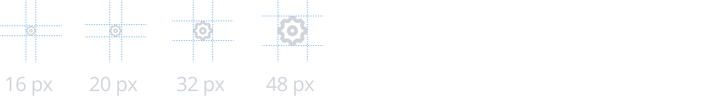
Icons can be set to 4 sizes based on its usage — normal (16x16px), medium (20x20px), big (32x32px), large (48x48px). The default size for all icons is the normal size. All action icons in particular are only displayed with the normal size.
When using status or symbol icons combined with text, the size of the icon should correlate with the font-size of the text. Make sure to choose the appropriate icon size of the 4 available to best match the height of the icon and the text together.
Example: Use the big icon size when paired with an h1.
### Action icons
Action icons represent controls to perform actions on resources or the page layout. They may be placed on their own or in a button.
#### Variants
Depending on the context, you can use action icons with the following variants: normal, disabled, inverted, link, or subtle.
#### Buttons
An action icon that's displayed on its own is called an [icon button](https://cloudscape.design/components/button/?example=icon-button). We recommend using this with standalone actions. All action icons include hover states and active states (when applicable) to increase usability.
Example: Settings icon in a table.
In contrast, you can also use action icons with the normal-style button when it’s grouped with other elements, such as within an [action stripe](https://cloudscape.design/components/header/) or attached to a [form field](https://cloudscape.design/components/form-field/?example=select-with-refresh). We recommend you use this style only for common actions, and that you include a text label describing the icon.
Example: Refresh button within an action stripe.
### Status icons
Status icons are visual representations that communicate the status of a resource in a compact form that’s easily embedded in other elements. The icon, color, and appending text are independent from each other and should be combined to best support your use case. If an existing icon is already sufficient for your use case, refrain from generating new status icons. For guidelines about common uses, see [status indicators](https://cloudscape.design/components/status-indicator/).
#### Shape
Status icons are distinguished from action and symbol icons by its additive structure. The shape is derived from the combination of a metaphorical state (for example, a check) and a specific shape (circle or triangle) to contain the state. Icons contained within squares are not status indicators.
#### Placement
Place status icons to the left of the resource or message that indicates a status.
### Symbol icons
Use symbol icons to bring additional visual emphasis or to symbolize an object that doesn't pertain to status. To avoid visual noise, use symbol icons sparingly and only when absolutely necessary.
#### Placement
Place symbol icons to the left of the resource or message that it supports.
