
Baby Design UI MCP Server
Click on "Install Server".
Wait a few minutes for the server to deploy. Once ready, it will show a "Started" state.
In the chat, type
@followed by the MCP server name and your instructions, e.g., "@Baby Design UI MCP Servergenerate code for a pastel-themed login modal using the Input and Button components"
That's it! The server will respond to your query, and you can continue using it as needed.
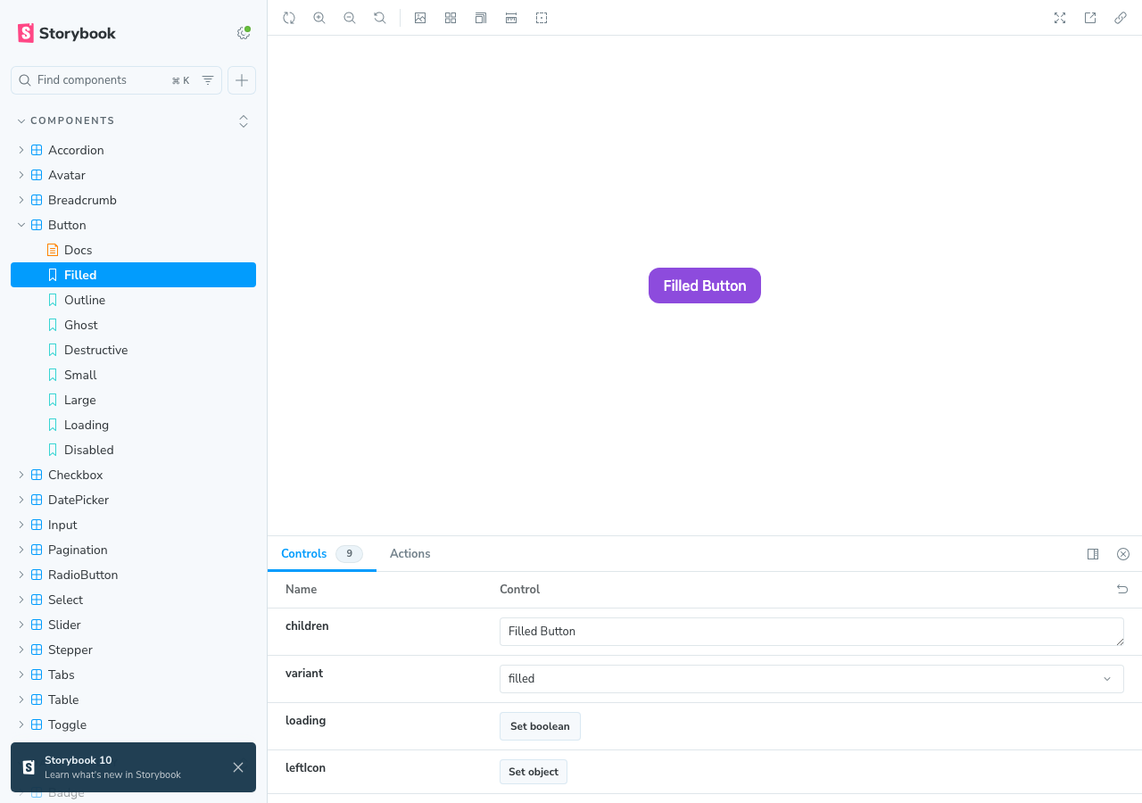
Here is a step-by-step guide with screenshots.
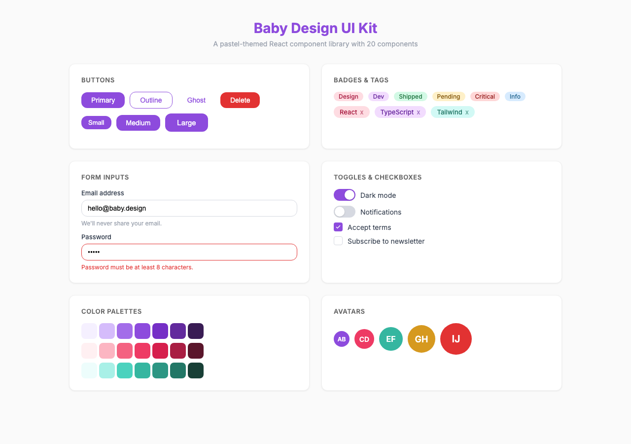
Baby Design UI Kit
A pastel-themed React component library with an MCP server for AI-assisted development.
Design Credit: Based on the Baby Design UI Kit by Trang Tran. All visual design, color palettes, typography choices, and component specifications originate from her work.
Packages
Package | Description |
| Design tokens (colors, typography, spacing) — no React dependency |
| React 18 component library (20 components) |
| MCP server exposing 5 tools via stdio |
Related MCP server: Component Library MCP Server
Quick Start
# Install
pnpm install

# Build all packages
pnpm build

# Run Storybook
pnpm storybook

# Run tests
pnpm test
Using the Component Library
npm install @mcp-baby-design-ui/reactimport { Button, Input, Modal } from "@mcp-baby-design-ui/react";
import "@mcp-baby-design-ui/react/globals.css";
function App() {
return (
<Button variant="filled" size="md">
Click me
</Button>
);
}Components (20)
Form Components
Button — filled/outline/ghost/destructive, 3 sizes, loading state
Input — text/password/email, label, helper text, char count, error
Checkbox — default/indeterminate/checked, keyboard navigation
RadioButton — radio group with arrow key navigation
Toggle — switch with label, 3 sizes
Select — single/multi, searchable, custom options
DatePicker — calendar grid, month/year navigation
Slider — single value, min/max/step
Feedback & Overlay
Tooltip — 4 positions, portal-based
Toast — info/success/warning/error, auto-dismiss queue
Modal — focus trap, scroll lock, ESC close
Badge — filled/outline, color variants
Tag — removable, with icon
Navigation & Data
Pagination — numbered, prev/next
Table — sortable columns, compound pattern
Tab — horizontal/vertical, keyboard navigation
Stepper — numbered/bar, step states
Accordion — single/multi expand mode
Breadcrumb — separator, current page
Avatar — image, initials fallback
Design Tokens
9 color palettes with 10 shades each (50-900):
Primary (pink), Secondary (purple), Success (green)
Warning (amber), Error (red), Info (blue)
Neutral (gray), Coral, Teal
Plus typography scales, spacing, border radii, and shadows.
MCP Server
The MCP server lets AI assistants discover and generate code for components.
Configuration
Add to your Claude Code or MCP client config:
{
  "mcpServers": {
    "baby-design-ui": {
      "command": "npx",
      "args": ["-y", "@mcp-baby-design-ui/mcp-server"]
    }
  }
}
Tools
Tool | Description |
| List all components with descriptions |
| Detailed docs, props, usage for a component |
| Generate TSX code with specific props |
| Retrieve design tokens |
| Text preview + code example |
Development
# Build tokens first (UI depends on it)
pnpm --filter @mcp-baby-design-ui/tokens build

# Build UI library
pnpm --filter @mcp-baby-design-ui/react build

# Build MCP server
pnpm --filter @mcp-baby-design-ui/mcp-server build

# Run all tests
pnpm test

# Storybook
pnpm storybook
Tech Stack
React 18 + TypeScript
Tailwind CSS + CSS custom properties
class-variance-authority (cva) for variants
Vite for library build
@modelcontextprotocol/sdk for MCP server
Storybook for component docs
Vitest + React Testing Library for tests
Credits
Design by Trang Tran — Baby Design UI Kit.
License
MIT
This server cannot be installed
Maintenance
Resources
Unclaimed servers have limited discoverability.
Looking for Admin?
If you are the server author, to access and configure the admin panel.
Latest Blog Posts
- Your AI Chatbot Just Exposed Your CEO's Salary to an InternBy Om-Shree-0709 on .Agent IdentityMCP SecurityOAuth Delegation
- Why MCP Servers Need Execution Sandboxing (And Why Your Current Stack Isn't Enough)By Om-Shree-0709 on .Agentic AiPrompt InjectionWebAssembly
MCP directory API
We provide all the information about MCP servers via our MCP API.
curl -X GET 'https://glama.ai/api/mcp/v1/servers/kim-nguyenkhn/mcp-baby-design-ui'
If you have feedback or need assistance with the MCP directory API, please join our Discord server